Pages

Saturday, October 1, 2011

fall brings flavor

My FAVORITE thing about fall, accept for the crisp air and layered clothes would have to be all the amazing seasonal ingredients. So many ways to incorporate fall flavors...Here are my favs:

Pumpkin Pancakes


Fluffy, Flavorful...AMAZING


Starbucks Hot Caramel Apple Cider

Screams Fall, Sweet, Spiced, Succulent.


Pull-Apart Squash Rolls
Fresh, Soft, and the best baked roll you will ever have. A hint of flavor from the squash, but a whole lot of mouth-watering goodness from this dense doughy roll, perfect for Thanksgiving.

Saturday, September 24, 2011

snapshot

 
Cape Cod in Shades of Blue

Taken on a boat ride through the many inlets of Falmouth, MA

Thursday, August 25, 2011

feast your eyes on this

Smelling, tasting, experimenting, satisfying, gratifying...all things the wonderful world of cooking brings to me. Let's just say I'm happy in the kitchen when it comes to cooking, maybe not the cleaning up part, but just see for yourself.

Here are a few things I've come up with in the past few months. Recipes upon request, if I even used one!


Chicken Tika Masala


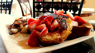
Challah French Toast | Fresh Strawberries | Homefries


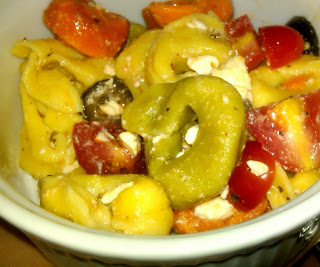
Greek Tri-Colored Tortellini Salad


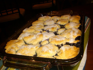
Wild Maine Blueberry Cobbler


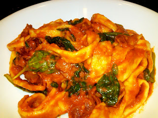
Homemade  Pappardelle Pasta | Tomato Bacon Cream Sauce | Spinach


I just wish you could sense this enjoyment like I was able to!
Let me add, some pictures are amateur due to my inability to wait to take a picture before divulging in! 

Monday, April 4, 2011

affinitea&co brand and packaging design project


PACKAGE TEMPLATE & TEA BAG PACKAGE DESIGN 


3 SIDES OF LABLES


 WEBSITE DESIGN

3-D RENDERING OF PACKAGE DESIGN


PHOTOS OF ACTUAL PACKAGING


Affinitea&co is a brand of tea and other products such as merchandise (teapots, tea sets, organic flavorings, loose tea) and many other items that encompass the tea lovers needs. Affinitea is an elegant traditional tea company with a few modern twists. 

In choosing a name for this brand, affinity was considered because it has a nice sound to it and also had a significant meaning; a natural liking or inclination towards something. After starting to work with the logo affinity became affinitea fitting perfectly into the actual products market. The “&co” was added to refer to the company aspect of it as well as inform that other products are sold. 

The overall design and feel of affinitea&co is simplistic, clean, elegant and uses a more subdued color palette. Tea is a delicate, elegant and also an organic experience; this is portrayed in the logo design using an organic “brushed” effect and the pairing of an organic yet sophisticated typeface. The colors are representational of the orange and yellow tones tea can have they are bright and cheery as well. The packaging includes a distinguishing color per flavor variation. The individually wrapped tea bags come in a small triangular labeled wrapper keeping each tea bag fresh and sterile, also easily portable. 

Tea is and always will be a desirable product among consumers. Its roots go back about 5.000 years in time “ 2009 was the 18th consecutive year that consumer purchases of tea increased, according to The Tea Association,” so considering its remained popularity today, tea is a great product to market.


Friday, April 1, 2011

new branding project in the works

Currently I am working on a new business branding project. The business is a cycling warehouse/store also including a small cafe and maintenance shop. It's an all inclusive store for the cycling enthusiast; a place where they can immerse in their passion for cycling and also provide a hang out for people alike, indoor and outdoor bike racks provided!

Its location is at a historic warehouse location in NYC bearing fabulous exposed brick and wood beams. I will be creating the full brand initiative including logotype, name, promotional products, website and print materials essentially the overall design and brand image. Currently the name is set to "burn the road" cycling shop+cafe...still in the preliminary process...I will be sure to update and post the final results.

Tuesday, March 29, 2011

violin: so underated

I really admire the sound of the violin, it's a beautiful instrument that has such a distinguished sound and dimension when added with other instruments. I was very pleased to come across a very talented individual, Eric Stanley, who expresses his inherent passion of the violin by covering a ton of pop songs today.  Check out this video and his you tube channel and be amazed!

Saturday, March 19, 2011

want to know the history and applications of film editing?

Film editing is a process that dates way back in time and has such an importance in the film industry today. So many reasons we enjoy and invest our lives watching movies is on behalf of talented editors and directors work. Watch this educational video I edited and narrated all about the beginning development of editing and the application of it from some of the world's greatest films.


warning: some video clips contain disturbing violence

Thursday, February 24, 2011

sustain the world poster campaign


 In designing these two call to action posters, I considered the visual impact as well as the overall message in mind. As the colors and typography grab your attention the words themselves are intriguing and thought provoking. Choosing to play with a famous quote from President Kennedy was my tactic to gain attention and prove a simple yet powerful point. The campaign's second poster incorporates strong text as well, however choosing a question to provoke thought and interest was another way to attract interest in a simplified manner as well. 

As for more on the design aspect, strong typography goes a long way in poster design. It plays both roles being equally as beautiful and informative. Both posters also include a simple relating graphic incorporating subtle text of how you can personally achieve what the poster calls for; a sustainable world. My overall thought concept includes that anyone can help sustain the world's environment in simple ways and if we all contribute together change can occur.

Monday, February 14, 2011

for the holiday

what a cute simple idea! spice up your paperwork in time for v day...


Monday, February 7, 2011

TB Lightning striking a new look


Tampa Bay Lightning redesigns their logo boasting a more simple "old school" retro design. The switch to using a new signature blue as the only color stands out on the white background foregoing the other grey and dark blue was a smart move and I'm liking the turn out of the simplified design.

The "Tampa Bay" is more prominent yet the one problem i see is the "B" in the text stands out a little too much; something about it is a little too bold compared to the rest of the text. The new shape of the lightning bolt is more defined and the use of one color really pulls through here. At first I was not that impressed but after seeing it used on multiple mediums, especially on their jerseys, and the logo in other formats ( patch shown below) my initial apprehension changed.